Calendar view
- name:
- Calendar view
- description:
- Displays elements inside a monthly, weekly or daily calendar
- version:
- 2.2.2
- release:
- 2025-02-11
- itop-version-min:
- 2.7.0
- code:
- combodo-calendar-view
- state:
- stable
- diffusion:
- iTop Hub
- php-version-max:
- PHP 8.3
You want to:
-
See your planned Changes on a calendar view?
-
Get a quick overview of contracts ending next month?
-
Visualize Physical Devices reaching End of warranty on a timeline view?
Then this extension is for you.
Features
This extension brings a new Calendar Dashlet which can be added to any Dashboard
From a user perspective
-
Objects are displayed on a calendar view, as meetings in a google calendar,
-
Objects can have a different color depending on a field value (status for eg.),
-
User can switch between Day, Week, Month or List display modes,
-
User can navigate to the next or the previous day/week/month,
-
User can choose to hide some groups of objects, within the displayed ones,
Revision History
| Date | Version | Description |
|---|---|---|
| 2025-02-11 | 2.2.2 | * N°7932 - Add english (GB) translation to iTop * N°3770 - Do not display objects that the user is not allowed to read * N°7840 Suppress risky syntax with DateTime::modify |
| 2023-11-28 | 2.2.1 | * N°5417 - Migrate usage of
iPageUIExtension/AbstractPageUIExtension * N°7334 - Remove embedded moment.js lib and use iTop core version |
| 2023-11-28 | 2.1.4 | * N°6499 - Display AttributeDate correctly (no time) and fix last day not displayed in timespan |
| 2023-07-13 | 2.1.3 | * Add compatibility with PHP 8.0 * Fix some translations unused * N°5549 - PHP 8.1: Add compatibility : calendar view |
| 2022-08-26 | 2.1.2 | - Add iTop 3.1 compatibility - Fix tooltip style for iTop 3.0.2 |
| 2021-12-21 | 2.1.1 | - Add iTop 3.0 compatibility |
| 2020-03-06 | 2.0.3 | - Fix non editable dashboard when malformed OQL in
dashlet - Fix an issue when scope containing a “:this→xxx” returned no result - Add dutch translation thanks to Jeffrey Bostoen! |
| 2019-07-02 | 2.0.2 | - Fix assets being kept in cache |
| 2019-06-20 | 2.0.1 | - Rename dictionnaries files - Fix script loader when more than one calendar is displayed - Security hardening |
| 2018-08-13 | 2.0.0 | - New version generic version of the extension, fully customizable without any code. |
Limitations
It's not possible to display FunctionalCIs at the date of a Change they are linked to. The date field must be an attribute of the displayed object.
Requirements
-
iTop 2.4 or later
Installation
Use the Standard installation process for this extension.
Configuration
Some configuration parameters are available for this extension:
| Parameter | Description | Default |
|---|---|---|
| default_scope_count | Default number of scopes when creating a new dashlet | 3 |
| max_scope_count | Maximum number of scopes a dashlet can have. This parameter is for all calendar view dashlets. | 10 |
| default_event_duration | Default duration in minutes for events that have only a start or end date. | 30 |
| first_day | First day of week. This parameter is for all calendar view dashlets, no matter the user language. Value can be 0 (sunday), 1 (monday), … | 1 |
| business_hours | Highlighted period of the week in dashlets (events can be created outside this period). A PHP array containing the days_of_week (same pattern as the first_day parameter, default is array(1,2,3,4,5)), start hour (default is 09:00), end hour | 18:00 |
  'combodo-calendar-view' => array (
                'default_scope_count' => 4,
                'max_scope_count' => 10,
                'default_event_duration' => 15,
                'first_day' => 1,
                'business_hours' => array (
                  1 => '08:00, 19:00',
                  2 => '08:00, 19:00',
                  3 => '08:00, 19:00',
                  4 => '08:00, 19:00',
                  5 => '08:00, 19:00',
                ),
        ),
Usage
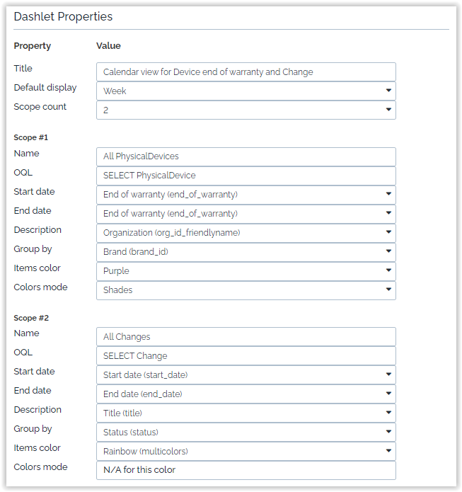
Designing a Calendar Dashlet
The Dashlet designer specifies
-
the objects displayed in the Dashlet as scopes
-
sub-groups of object based on a field (groups per status for example)
-
the colors to use per group of object,
-
the default display mode,….
| Property | Purpose |
|---|---|
| Title | Title is displayed on the top banner of the calendar, it can be a dictionary entry eg. UI:RequestMgmtMenuOverview:Title |
| Default display | This is the default display mode, which is used when the dashboard is displayed, the user can still change the display mode, but it is not recorded. Next refresh of the page will restore the default display |
| Scope count | Change this number if you want to define more than 3 groups of objects to display in the same dashlet. It will expend the form with more scopes. When saving empty scopes are ignored |
| scopes # | |
|---|---|
| Name | Label of the scopes as displayed in the selection bar |
| OQL | An OQL query which must return a single class of objects to display |
| Start date | A mandatory date or date-time field of the above class, which is used as the start time for displaying the object in the calendar. |
| End date | An optional date or date-time field of the above class, which is used as the end time for displaying the object in the calendar. |
| Description | An optional field which value will be displayed in a tooltip while moving your mouse above an object |
| Group by | An optional field to divide your scopes in groups. |
| Items color | A fixed selection of predefined colors, plus an extra “Rainbow (multicolors)” |
| Colors mode | Plain which is the default, means
every groups will use the same colors, Shades means a
different shade of the color will be used for each group |
-
If
dateattribute (without time) is used either the Start date or the End date, the objects are displayed as full-day event in Daily and Weekly display mode. -
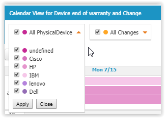
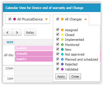
Group byfield values will displayed under the scope name, hidden by default.
-
If “Rainbow (multicolors)” is selected then each group will get a different plain color, instead of a different shade of a unique color.
-
If no
Group byfield is selected, thenColors modeis useless and “Rainbow (multicolors)” is equivalent to “Orange”.
Example
Here is an example with 2 scopes, both with groups.
-
Physical Devices uses a purple “shades” grouping by “brand”
-
Changes uses a “Rainbow” grouping by “status”
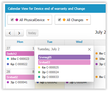
Using a Dashlet Calendar
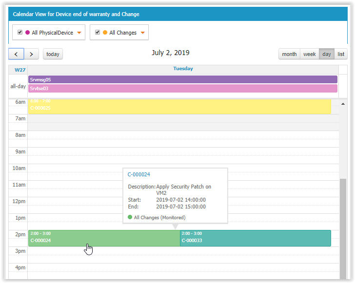
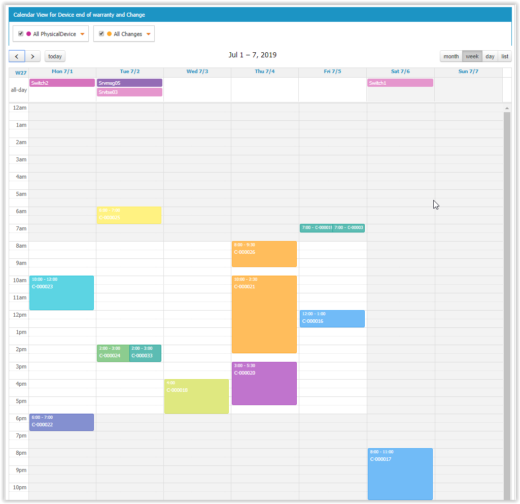
Here the display of the same example as below.
-
Change uses a date-time Start date and Start date End date, so object are displayed with their duration (Object with no End date will be displayed with a duration defined in the Extension configuration parameter default_event_duration),
-
Physical Device uses a date End warranty date, which means object are displayed as “all day” events in Daily and Weekly display modes
The default display mode of our example is a Week
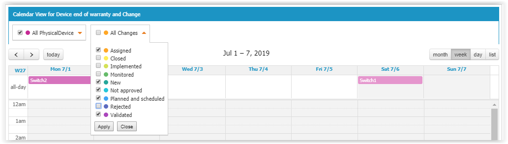
User can decide to hide some of the groups by opening the criteria and un-selecting some groups
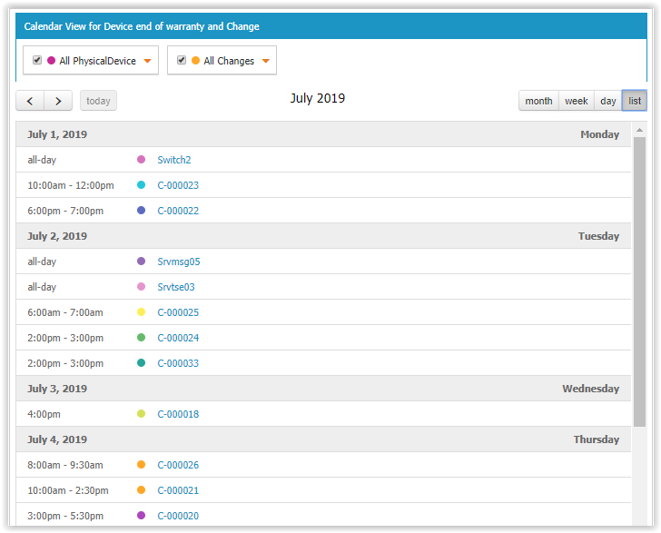
User can switch to a different display mode, such as List for a month:
or Month displayed as a table with one row per week and one cell per day:
-
Full day object have a colored background behind their name
-
Object with a starting hour, have a colored bullet in front of its name
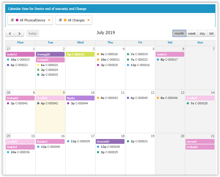
When there are too many objects in a cell, a number of not-yet-displayed objects is provided and you can click on it to display the complete list of objects for that day.
On any object displayed, moving the mouse over it display a tooltip with
-
the friendlyname,
-
the description,
-
the Start date,
-
End date,
-
The scope name and the group value in parentheses