How to create a new theme
Prerequisite: You must be familiar with the Syntax used in Tutorials and have already created an extension.
On top on the existing default themes, it is possible to:
-
change a few colors to align it to your company color codes.
-
or if you have CSS skills, create you own theme to change radically the look of your iTop console,
As usual with customizing iTop, it requires an extension, containing XML and maybe CSS files as well.
Change few colors
- itop_design
-
  <branding>
    <themes>
      <theme id="fullmoon">
        <variables>
          <variable id="ibo-hyperlink-color" _delta="define">purple</variable>
        </variables>
      </theme>
    </themes>
  </branding>
Change more colors
Main variables
| 3.0 SCSS Variable | Usage |
|---|---|
| ibo-color-primary-XXX | used in most place were you see orange in a standard iTop |
| ibo-hyperlink-color | used for text which are hyperlinks, such as menu entries, external keys |
| ibo-hyperlink-color--on-hover | Text color when going over a breadcrumb or hyperlink entry |
| ibo-color-secondary-XXX | fieldset legend background, table header text, frame border of edit container |
| ibo-color-secondary-XXX | frame background of edit container (object and transition) |
| ibo-navigation-menu--body--background-color | West pans (Menus) |
| ibo-top-bar--background-color | North pans (top bar) |
| ibo-navigation-menu--action--background-color--on-hover | Background color, when going over a group menu |
| ibo-tab-container--tab-header--background-color--on-hover | Background color, when going over a tab |
-
All the iTop 3.0 variables are defined in mutiple files under
<iTop>/css/backoffice/*-
ibo- means that's it is a new stuff (variable or class),
ibostands for Itop BackOffice therefore they are not available in the end-user portal -
ibo-vendor- means that it's a variable used within vendor (third-party lib.) provided SCSS rules
-
ibo-input-text--padding-x is a variable you will find under
<iTop>/css/backoffice/input/_input-text.scss
-
| Some new variables… | …and their usage |
| ibo-tab-container--tab-container--min-height | min height of a tab in scrollable mode |
| ibo-tab-container--tab-container--last--min-height | height of the last container in scrollable
mode Add some blank at the bottom to make it obvious that you are at the bottom and allow the tab title to be selected, while you are on it |
Variable values
Create an XML entry for each variable you want to change, with its new value.
-
You can set any numbers of variables.
-
If you define a variable id which does not correspond to any variables in any scss files, it will be ignored.
-
The variable value can be:
-
another variable like
$ibo-color-transparent,$ibo-body-text-color, … - The variable must be defined above -
colors :
-
color name:
purple -
hex color code:
#F6F6F6 -
RGB:
rgb(123, 123, 132) -
RGBA:
rgba(123, 123,123, 0.5) -
HSL:
hsl(123, 50%, 50%) -
HSLA:
hsla(123, 50%, 50%, 0.23)
-
-
text
-
number, eg. box-radius: 0
-
a scss function:
hue-rotate(-139deg)orlighten($brand-primary, 15%) -
…
-
You can also define them through a SCSS file containing a list of variables, since iTop 3.0 you need to add xsi:type=“variable” in such case to redefine a variable using another existing variable.
- itop_design | branding | themes
-
<theme id="light-grey">
   <imports>
      <import id="my-css-variables" xsi:type="variable" _delta="define">my-module/css/my-css-variables.scss</import>
   </imports>
</theme>
- my-css-variables.scss
-
$ibo-body-text-color: #000000;
$ibo-body-background-color: $ibo-color-white-200;
Stylesheets
You can define your own stylesheets files and your own scss file
within your module and specify them in the theme. These files can
contain mixins and helpers or style definition an we recommend
importing them as follow.
Assuming your SCSS files are located in the extension under
<my-module>/css/ then the path to set in the XML
is:
- itop_design | branding | themes
-
<theme id="fulmoon">
   <imports>
      <import id="my-helpers" xsi:type="utility" _delta="define">my-module/css/my-helpers.scss</import>
   </imports>
   <stylesheets>
      <stylesheet id="my-style" _delta="define">my-module/css/my-style.scss</stylesheet>
   </stylesheets>
</theme>
Enums
With Datamodel 3.0, you can Highlight enum values, independently of any themes
Create a new theme
/env-production/branding/old-scholl/main.css To see
the effects of a theme change, empty the browser cache
(Ctrl-F5)old-school theme
Create in XML a new theme for example old-school
which modify scss variables and add new css rules. For this you
will have to write scss files within an iTop extension.
-
You must separate the rules from the variables redefinition in different source files.
-
For variables you can redefine them either in a file under the
importtag or directly under avariabletag
- itop_design
-
  <branding>
    <themes>
      <theme id="old-school" _delta="define">
        <variables>
        </variables>
        <imports>
          <import id="old-school-scss-variables" xsi:type="variables">combodo-theme-old-school/scss/scss-variables.scss</import>
        </imports>
        <stylesheets>
          <stylesheet id="backoffice">../css/backoffice/main.scss</stylesheet>
          <stylesheet id="old-school">combodo-theme-old-school/scss/rules.scss</stylesheet>
        </stylesheets>
      </theme>
    </themes>
  </branding>
-
Note the use of xsi:type=“variables” when importing scss which must only contains “variables”
-
If you have CSS rules, specify them under the
stylesheettag -
You must specify the standard scss stylesheet
../css/backoffice/main.scss, unless you rewrite all of it, and rather in first position, for your own scss to overwrite the default one.
- rules.scss
-
.ibo-fieldset-legend {
        color: $ibo-color-grey-600;
        font-size: small;
        width:unset;
        border-bottom:0;
        margin-bottom:0;
        padding: 4px 4px 0 4px;
        margin-left: -4px;
}

.ibo-fieldset {
        border: 1px solid $ibo-color-grey-400 !important;
        padding: 10px 10px;
        border-radius: 6px;
        margin-top: 18px;
}
Result
Test instances themes
Here is the XML of the test-red iTop built-in
themes:
Add a colored banner at the top with a text message. It adds a new scss file for this.
For iTop 2.7
- itop_design | branding | themes
-
      <theme id="test-red" _delta="define">
        <variables>
          <variable id="backoffice-environment-banner-background-color">#C53030</variable>
          <variable id="backoffice-environment-banner-text-color">#F7FAFC</variable>
          <variable id="backoffice-environment-banner-text-content">
             "THIS IS A TEST INSTANCE"
          </variable>
        </variables>
        <imports>
          <import id="css-variables">../css/css-variables.scss</import>
        </imports>
        <stylesheets>
          <stylesheet id="jqueryui">../css/ui-lightness/jqueryui.scss</stylesheet>
          <stylesheet id="main">../css/light-grey.scss</stylesheet>
          <!-- Here we add another stylesheet -->
          <stylesheet id="environment-banner">../css/backoffice-environment-banner.scss</stylesheet>
        </stylesheets>
      </theme>
For iTop 3.0 onwards
- itop_design | branding | themes
-
      <theme id="test-red" _delta="define">
        <variables>
          <variable id="ibo-page-banner--background-color">$ibo-color-red-600</variable>
          <variable id="ibo-page-banner--text-color">$ibo-color-red-100</variable>
          <variable id="ibo-page-banner--text-content">"THIS IS A TEST INSTANCE"</variable>
        </variables>
        <imports>
        </imports>
        <stylesheets>
          <stylesheet id="fullmoon">../css/backoffice/main.scss</stylesheet>
          <stylesheet id="environment-banner">../css/backoffice/themes/page-banner.scss</stylesheet>
        </stylesheets>
      </theme>
Migrate to 3.0 themes
In the 2.7 version, all this was a “work in progress”. Now with version 3.0 we have totally reorganized the variables.
Themes names
You have a 2.7.x iTop version and you have customized
light-grey :
- itop_design | branding | themes
-
      <theme id="light-grey" _delta="force">
        ...
      </theme>
For iTop 3.0 onward, customize both fulmoon and
darkmoon themes :
- itop_design | branding | themes
-
      <theme id="fulmoon" _delta="force">
        ...
      </theme>
      <theme id="darkmoon" _delta="force">
        ...
      </theme>
SCSS files
/css/css-variables.scss.In a 3.0 theme you must either include
/css/backoffice/main.scss or define the variables
present in this file, otherwise the setup will crashFor example this code in a 2.7 theme :
        <stylesheets>
          <stylesheet id="jqueryui">../css/ui-lightness/jqueryui.scss</stylesheet>
          <stylesheet id="main">../css/light-grey.scss</stylesheet>
          <!-- Here we add another stylesheet -->
          <stylesheet id="environment-banner">../css/backoffice-environment-banner.scss</stylesheet>
        </stylesheets>
Must be replaced in 3.0 by :
        <stylesheets>
          <stylesheet id="fullmoon">../css/backoffice/main.scss</stylesheet>
          <stylesheet id="environment-banner">../css/backoffice/themes/page-banner.scss</stylesheet>
        </stylesheets>
Variables names mapping between 2.7 and 3.0
Direct matches
| 2.7 variable | 3.0 variable |
|---|---|
| hyperlink-color | ibo-hyperlink-color |
| breadcrumb-text-highlight-color | ibo-hyperlink-color--on-hover |
| frame-background-color | ibo-navigation-menu--body--background-color |
| frame-background-color | ibo-top-bar--background-color |
| hover-background-color | ibo-navigation-menu--action--background-color--on-hover |
| hover-background-color | ibo-tab-container--tab-header--background-color--on-hover |
iTop 3.0 -XXX variables
In 3.0 some variables are used with some variations. It means that in 2.7 you may declare only one color in one variable, and in 3.0 you'll have to set mtuliple variables with color variation.
Here are the main variables concerned :
| 2.7 variable | 3.0 list of variables |
|---|---|
| brand-primary | ibo-color-primary-XXX |
| complement-color | ibo-color-secondary-XXX |
| complement-light | ibo-color-secondary-XXX |
XXX are :
-
range from 100 to 900 : 100, 200, 300, .. 900
-
950
So for each “-XXX” we get 10 variables.
A little more...
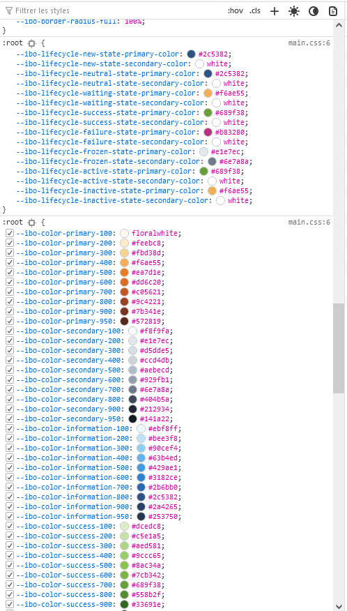
To use an existing iTop color code, check the existing values within a 3.0+ iTop with the browser development tool. Then transform it following one of those 2 possible syntax:
-
$ibo-lifecycle-success-state-primary-color' -
var(--ibo-lifecycle-success-state-primary-color)
The advantage of using those existing colors, is that a theme creation or modification would apply to your setting/new classes, so you keep consistency within your iTop.
Some default mapping showing where the primary colors are used:
- related to primary_color
-
$ibo-quick-create--icon--color: $ibo-color-primary-600 !default;
$ibo-quick-create--icon--color--on-hover: $ibo-color-primary-700 !default;
$ibo-quick-create--icon--color--on-active: $ibo-color-primary-800 !default;

$ibo-global-search--icon--color: $ibo-color-primary-600 !default;
$ibo-global-search--icon--color--on-hover: $ibo-color-primary-700 !default;
$ibo-global-search--icon--color--on-active: $ibo-color-primary-800 !default;

$ibo-hyperlink-color: $ibo-color-primary-700 !default;
$ibo-hyperlink-color--on-hover: $ibo-color-primary-800 !default;
$ibo-hyperlink-color--on-active: $ibo-color-primary-900 !default;

$ibo-keyboard-shortcut--input--is-focus--color: $ibo-color-primary-800 !default;
$ibo-keyboard-shortcut--input--is-focus--border-color: $ibo-color-primary-600 !default;

$ibo-datatable--row--background-color--is-hover: $ibo-color-primary-200 !default;
$ibo-datatable--row--background-color--is-selected: $ibo-color-primary-300 !default;

$ibo-vendors-datatables--page-length-selector--border-color--on-focus: $ibo-color-primary-600 !default;
$ibo-vendors-jquery-treeview--treecontrol--hover: $ibo-color-primary-600 !default;

$ibo-activity-panel--add-caselog-entry-button--background-color: $ibo-color-primary-600 !default;
$ibo-activity-panel--add-caselog-entry-button--background-color--on-hover: $ibo-color-primary-500 !default;
$ibo-activity-panel--add-caselog-entry-button--background-color--is-active: $ibo-color-primary-700 !default;

$ibo-svg-illustration--fill: $ibo-color-primary-500 !default;