How to change Console colors
Prerequisite: You must be familiar with the Syntax used in Tutorials and have already created an extension.
On top on the existing default themes, it is possible to:
-
change a few colors to align it to your company color codes.
-
or if you have CSS skills, create you own theme to change radically the look of your iTop console,
As usual with customizing iTop, it requires an extension, containing XML and maybe CSS files as well.
Console main color
Customize in XML default theme light-grey
- itop_design
-
    <branding>
        <themes>
            <theme id="light-grey">
                <variables>
                    <variable id="brand-primary" _delta="force">
                        <!--Put your color here -->
                    </variable>
                </variables>
            </theme>
        </themes>
    </branding>
The color value can be:
-
a color name: green
-
a color code: #F6F6F6
-
a function: lighten($brand-secondary, 15%)
-
another variable
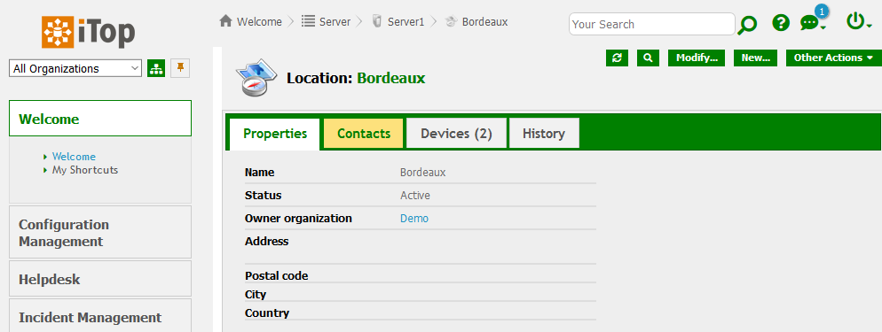
Here is the result of changing brand-primary to
green: 
Change more colors
In the 2.7 version, consider all this as work in progress. Version 3.0 should clean and reorganized the variables.
Main variables
| CSS Variable | Usage |
| brand-primary | used in most place were you see orange in a standard iTop |
|---|---|
| hyperlink-color | used for text which are hyperlinks, such as menu entries, external keys |
| complement-color | fieldset legend background, table header text, frame border of edit container |
| complement-light | frame background of edit container (object and transition) |
| main-header-background | Dashlet header background color |
| frame-background-color | North and West pans |
| breadcrumb-text-highlight-color | Text color when going over a breadcrumb entry |
| search-criteria-more-less-details-color | Icons on search criteria, to see more or less operators |
| hover-background-color | Background color, when going over a group menu or a tab |
| table-hover-background | Background color, when going over a row in a list of objects |
| content-color | Background color for Menu, Details, Pop-up windows,… |
| button-header-background-color | Background color for object tabs |
| main-menu-background-color | Background color for main header menus |
| … | |
| text-color | most text in iTop |
| brand-secondary | not yet used |
| highlight-text-color | does not seems to be used |
| highlight-color | it's set to brand-primary - DO NOT change it |
-
There are more variables, to get them all, open the file
<iTop>/css/css-variables.scss -
To get their usage, search for their name in all files of
<iTop>/css/*
Variable values
Create an XML entry for each variable you want to change, with its new value.
-
You can set any numbers of variables.
-
If you define a variable id which does not correspond to any variables in any scss files, it will be ignored.
-
The value you can put on a variable can be:
-
another variable - The variable must be defined above
-
a color name: purple
-
a color code: #F6F6F6
-
a text
-
a number, eg. box-radius: 0
-
a function:
hue-rotate(-139deg)orlighten($brand-primary, 15%) -
…
-
Stylesheets
You can define your own stylesheets files and your own scss file
within your module and specify them in the theme.
Assuming your CSS files
are located in the extension under
<my-module>/css/ then the path to set in the XML
is:
- itop_design | branding | themes
-
<theme id="light-grey">
   <imports>
      <import id="my-css-variables" _delta="define">my-module/css/my-css-variables.scss</import>
   </imports>
</theme>
Braun example
- itop_design | branding | themes
-
  <theme id="light-grey">
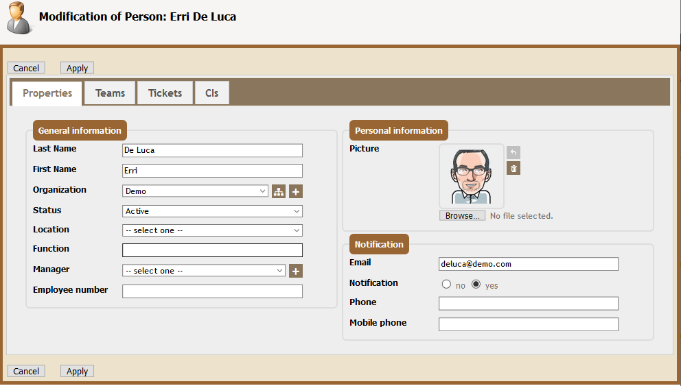
    <variables _delta="redefine">
      <variable id="brand-primary">#8a765c</variable>
      <variable id="frame-background-color">lighten($brand-primary,50%)</variable>
      <variable id="main-header-background">$frame-background-color</variable>

      <variable id="complement-color">#996633</variable>
      <variable id="hyperlink-color">darken($complement-color,15%)</variable>
      <variable id="breadcrumb-text-highlight-color">darken($complement-color,15%)</variable>
      <variable id="search-criteria-more-less-details-color">darken($complement-color,15%)</variable>

      <variable id="complement-light">lighten(#dac292,15%)</variable>
      <variable id="hover-background-color">$complement-light</variable>
      <variable id="icons-filter">hue-rotate(42deg)</variable>
    </variables>
  </theme>
Define your own theme
Instead of altering the Combodo light-grey theme,
you can also define a totally different theme here
violeto-maximus, within an extension:
- itop_design
-
    <branding>
        <themes>
            <theme id="violeto-maximus" _delta="define">
                <variables>
                    <variable id="brand-primary">purple</variable>
                    <variable id="icons-filter">hue-rotate(230deg)</variable>
                    <variable id="complement-color">MediumPurple</variable>
                    <variable id="border-highlight-color">purple</variable>
                    <variable id="combodo-dark-gray">blue</variable>
                </variables>
                <imports>
                    <!-- Use exactly the below line, unless you define your own SCSS file -->
                    <import id="css-variables">../css/css-variables.scss</import>
                </imports>
                <stylesheets>
                    <!-- Use exactly the below lines, unless you define your own SCSS files -->
                    <stylesheet id="jqueryui">../css/ui-lightness/jqueryui.scss</stylesheet>
                    <stylesheet id="main">../css/light-grey.scss</stylesheet>
                </stylesheets>
            </theme>
        </themes>
    </branding>
and in the Configuration file, you set this new theme
- Configuration
-
'backoffice_default_theme' => 'violeto-maximus',
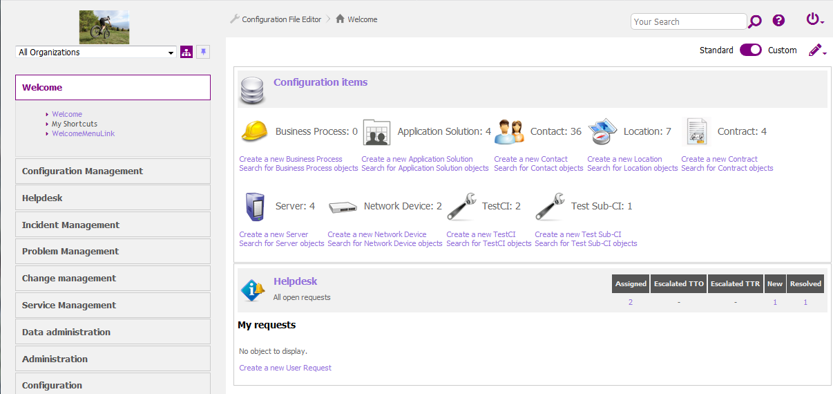
Then the console will look like this:
In general, you should reuse the above scss files for
<imports> and <stylesheets>
values, but you may also rewrite them from scratch
Test instances themes
Here is the XML of the test-red iTop built-in
themes:
Add a colored banner at the top with a text message. It adds a new scss file for this.
- itop_design | branding | themes
-
      <theme id="test-red" _delta="define">
        <variables>
          <variable id="backoffice-environment-banner-background-color">#C53030</variable>
          <variable id="backoffice-environment-banner-text-color">#F7FAFC</variable>
          <variable id="backoffice-environment-banner-text-content">
             "THIS IS A TEST INSTANCE"
          </variable>
        </variables>
        <imports>
          <import id="css-variables">../css/css-variables.scss</import>
        </imports>
        <stylesheets>
          <stylesheet id="jqueryui">../css/ui-lightness/jqueryui.scss</stylesheet>
          <stylesheet id="main">../css/light-grey.scss</stylesheet>
          <!-- Here we add another stylesheet -->
          <stylesheet id="environment-banner">../css/backoffice-environment-banner.scss</stylesheet>
        </stylesheets>
      </theme>


