Lifecycle Edition
ITSM Designer - Combodo's customers only
The lifecycle is used to define a simple workflow for classes like tickets, where the behavior of the fields depend on the state of the ticket (a field may be editable only during some specific phases, mandatory in another phase or even completely hidden)
Using the lifecycle one can:
-
define the allowed “states” for the class
-
configure the allowed transitions from one state to another (and associate actions to each transition)
-
configure the behavior of the fields, depending on the current state of the class
-
create stopwatches to record the time spent in the different states and configure thresholds for triggerring notifications
-
configure the highlight color (in lists) and the icon of the class, depending on the current state (or the passed thresholds)
The edition of the lifecycle of a class is performed via a third tab “lifecycle” on the schema of a class.

The lifecycle tab is divided in three main parts:
-
The central pane, with the blue background, displays the lifecycle graph, showing the different states and the transitions from one state to another
-
The lower pane displays 3 lists: stopwatches, events and higlight codes
-
The left pane displays the properties of the currently selected element (either a state, a transition, a stopwatch, an event or a highlight code). This is the place where to edit the properties of the elements.
Managing the center pane
To adjust the display of the center pane:
-
Click and drag anywhere in the blue background to scroll the pane
-
Click and drag on a state to move it
-
Use the mouse wheel to zoom in/out
-
Click on the small “Options” button at the top-right corner of the view to configure the elements displayed in the pane

You can reset the positions of the states, the paths of the transitions and the zoom levelof the pane at any moment, by doing a right click in the blue background and selecting “Reset View” from the popup menu.

Toolbar
| Icon | Label | Action |
|---|---|---|
 |
Add State | Create a new state for the class |
 |
Remove State | Remove the currently selected state (and all the related transitions) from the class |
 |
Add Transition | Create a transition from one state to another, based on a specific event |
 |
Remove Transition | Remove the select transition. The actions associated with the transition (if any) are also removed |
Managing States
To edit the properties of an existing state, click on in it in the central pane. The properties of the state are then displayed as an editable form in the left pane:

The properties of a state are the following:
| Property | Meaning |
|---|---|
| Code | This is the unique value which identifies the state. Since the state values are stored as an ENUM in the database it is better to keep them simple (no space, no accentuated or punctuation characters) |
| Label | This is the localized display label for the state |
| Initial state | Whether or not the current state is the default state for all newly created objects of this class. |
| Highlight Code | If non-empty, the background color (in lists) and the icon representing the object in this state will be determined by the selected highlight code - if no other highlight code of higher rank applies |
Behavior of the fields
The behavior of the fields of the object can be altered when the object is in the current state. Basically there are 4 possibilities (called flags) for a given field. The field can be:
-
Hidden: the field is not displayed at all from the “Details” form and cannot be edited,
-
Read-only: the field is displayed in the “Details” form but cannot be edited,
-
Read-write: the field is displayed and can be edited. This the default behavior,
-
Mandatory: the field is displayed, can be edited but cannot be empty
Another set of flags determines the behavior of the field when the object enters the current state:
-
Must Prompt: the end-user will prompted to enter a value for the field. If the field is not mandatory (either per the definition of the field or per the Mandatory flag), the end-user may leave the value empty and ignore the prompt.
-
Must Change: the end-user will be prompted to change the value of the field. The form cannot be validated until the value has been changed. Whether or not an empty value is suitable for the field depends on the Mandatory flag and the field definition.
Instead of repeating the same behavior accross the whole lifecycle, it is possible for a state to inherit its flags from another state. This is achieved by checking “Inherit flags from the state” and selecting the desired state as the source for the flags. One can then alter the behavior by just overloading the definition of the flags for the fields for which the behavior is different in the current state (compared to the “inherited” state).
The toggle  filters the list underneath
by showing only the fields which flags are not inherited from the
parent state. Clicking on “Show” will display the flags for all the
fields.
filters the list underneath
by showing only the fields which flags are not inherited from the
parent state. Clicking on “Show” will display the flags for all the
fields.
Editing the behavior
To edit the behavior of a field, click the pencil icon  on the corresponding line. The following dialog
box is displayed:
on the corresponding line. The following dialog
box is displayed:

If the state inherits its flags from the target state a warning is displayed to inform the user.
Creating a new state
To create a new state, click on the “Add State” toolbar button. The following
dialog is displayed:

Fill the mandatory properties and click “Create State”. The panes are then refreshed to take into account the newly created state.
Deleting an existing state
You can delete the selected state by clicking on the “Remove
State” toolbar button, or by doing a
right-click on the state and selecting “Delete State” from the
popup menu. A confirmation dialog (listing the consequences of this
removal) is displayed:

Click “Ok” to proceed with the removal of the state.
Managing Transitions
To edit the properties of a transition, click on the arrow representing the transition in the central pane. The properties of the selected transition are then displayed in the left pane.

When the transition is selected, small square handles are displayed next to the path. You can drag these handles around to adjust the path representing the transition.
A right click on the path brings a popup menu with two options:
-
“New Control Point”: creates a new handle to adjust the curve of the path
-
“Delete Transition”: deletes the selected transition

Similary, a right click on one of the square handles brings another popup menu with just one item: “Delete Control Point”.

A transition is defined by 3 properties:
| Property | Meaning |
|---|---|
| Origin State | The state from which the transition starts |
| Event | The code of the event which causes the transition to happen. |
| Destination State | The state reached after the transition. Can be the same as the Origin state. |
Behavior of the fields
The behavior of the fields of the object can be altered on the transition. The field can be:
-
Mandatory: the field is displayed, can be edited but cannot be empty
Another set of flags determines the behavior of the field when the object enters the target state:
-
No Prompt: the field will no be presented to the user.
-
Must Prompt: the end-user will prompted to enter a value for the field. If the field is not mandatory (either per the definition of the field or per the Mandatory flag), the end-user may leave the value empty and ignore the prompt.
-
Must Change: the end-user will be prompted to change the value of the field. The form cannot be validated until the value has been changed. Whether or not an empty value is suitable for the field depends on the Mandatory flag and the field definition.
The toggle filters the list underneath
by showing only the fields which flags are not set in the target
state. Clicking on “Show” will display the flags for all the
fields.
Editing the behavior
To edit the behavior of a field, click the pencil icon on the corresponding line. The following dialog
box is displayed:
If the state inherits its flags from a parent state, the check box “Inherit the flags from <state>” can be checked to revert to the inherited behavior.
If one (or more) state(s) inherit their flags from the current state, and do not overload the behavior for the selected field, a warning message is displayed to inform the user that the modification of the behavior of this field will also have an impact in the other states.
Creating a new transition
To create a new transition, either click on in the toolbar, or right click on a state an
choose “New Transition” from the popup menu. The following dialog
will appear:

Once you've selected the 3 parameters, click Ok to create the new transition. The graph will refresh to show the new transition.
Deleting a transition
To delete a transition, either click in the toolbar, or right click on the
transition and select “Delete Transition” from the popup menu.
A confirmation dialog will appear:

Actions on transitions
The processing of a transition can launch several actions, which will be executed sequentially before the state changes. An action is defined by an operation (defining the type of action to perform) and parameters. The type and number of parameters depend on the action.
The following predefined operations are available in iTop:
| Operation | Available on | Meaning | Parameters |
|---|---|---|---|
| AddValue | Any class | Add a decimal value to an integer,
decimal, percentage or
duration field |
Target field: the field to
modify Value: decimal added value which can be negative, default 1 |
| Copy | Any class | Copy the value of one field into another | |
| Reset | Any class | Reset a field to its default value | Target Field: The field to reset |
| ResolveChildTickets | UserRequest, Incident | Cascade the resolution to child tickets (ev_autoresolve), and align the following characteristics of the request: service, team, agent, resolution info | None |
| Set SetIfNull |
Any class | Set a field with a static value only if the field is empty |
Target field: the field to
set Value: the value to set |
| SetComputedDate SetComputedDateIfNull |
Any class | Set a target field with a date computed from a
source field only if the target field is empty |
Target field: the field to
modify Modifier: the string to modify the date Source field: the field used as a base to apply the Modifier |
| SetCurrentDate SetCurrentDateIfNull |
Any class | Set a field with the current date and time only if the field is empty |
Target field: the field to set |
| SetCurrentUser | Any class | Set a field with the currently logged in user | Target field: the field to set |
| SetElapsedTime | Any class | Set a field with the time (seconds) elapsed since a date given by another field | Target field: the field to
set Reference Field: the field containing the starting date for the computation of the duration Working Hours (optional): if specified a class for computing the working hours. If left empty the computation will be performed on 24×7 basis. |
For SetComputedDate and SetComputedDateIfNull:
-
What to put in the
Modifier?-
+5 days, -3 weeks
-
first weekday of next month, monday of next week
-
Formore options
-
-
Source fieldcan be theTarget fielditself, if you want to modify a date starting from its current value.
Managing actions on transitions
To add an action on a transition, click on the  button at the bottom of the list of actions.
The following dialog box will appear:

To remove an action, click on the  button, next to the action to delete. No
confirmation will be asked.
button, next to the action to delete. No
confirmation will be asked.
 button in the
toolbar to undo unwanted modifications.
button in the
toolbar to undo unwanted modifications.Managing Stopwatches
What is a Stopwatch in iTop?
A stopwatch is a field of a class which maintains all the internal information needed to record the cumulated time elapsed while the object is in one of the active states for this stopwatch. A stopwatch is simply a kind of chronometer, hence its name. When the object is not in one of the active states of the stopwatch, the stopwatch is stopped and the time is not accumulated.
Some of the internal information of the stopwatch (initial start time, stop time, total elapsed duration…) can be exposed via other fields of the type “Stopwatch value”, but the stopwatch itself is to be considered as an opaque value. A stopwatch field cannot be edited manually.
A stopwatch can also be configured to have a goal (i.e. to compute a deadline). The goal is configured as a special class providing the algorithm about how to compute a duration for the stopwatch. iTop provides two classes to compute goals based on either the “Time To own” or “Time To Resolve” SLTs.
When a stopwatch has a goal defined, it is possible to assign one or more thresholds to it. The thresholds are then expressed as a percentage of the goal (50%, 100%, 120%…). As the time passes, the stopwatch can trigger notifications when thresholds are passed.
Editing a Stopwatch
To edit the properties of a stopwatch, select it by clicking on it in the list “Stopwatches” in the bottom pane.

| Property | Meaning |
|---|---|
| Code | The unique code of the stopwatch. Since the stopwatch is also a field of the class, this code must be a valid (and unique) field code. |
| Label | The localized label of the stopwatch, as a field of the class. |
| Active States | The list of states in which the stopwatch is “active” (i.e. accumulates the elapsed time). Use CTRL+click to perform a multiple selection |
| Has goal? | Whether or not this stopwatch has a goal. A stopwatch without goal can be used just to measure the elapsed time for reporting purposes |
| Goal | The algorithm used to compute the goal. Only two algorithms are available: Time To Own (based on the SLTs of type TTO) and Time To Resolve (based on the SLTs of type TTR). |
Managing Thresholds
If a stopwatch has a goal assigned, then thresholds can be defined, expressed as percentages of this goal. A threshold has just two properties:
| Property | Meaning |
|---|---|
| Percentage | The percentage at which the threshold is considered as passed. Values smaller than 100% will happen before the deadline while values greater than 100% will happen after the deadline is passed. |
| Highlight Code | The highlight code to use (if any) when this threshold is passed. The object will use the highlight code with the highest rank. |
To add a new threshold, click on the  button at the end of the list of thresholds.
The following dialog will be displayed:

To remove a threshold, click on the button, next to the threshold to delete. No
confirmation will be asked.
button in the
toolbar to undo unwanted modifications.To create a new stopwatch, click on the small  button next to
the title “Stopwatches” in the bottom pane.
button next to
the title “Stopwatches” in the bottom pane.
The following dialog is displayed:

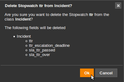
To delete the selected stopwatch, click on the small  button
next to the title “Stopwatches” in the bottom pane.
button
next to the title “Stopwatches” in the bottom pane.
The following confirmation dialog is displayed, listing the consequences of this removal:
Managing Events
Events are the stimuli which cause the changes in the workflow of an object in iTop. In response to an incoming event, the object may initiate a transition (possibly executing some actions) for finally changing its state. If no transition is configured for the incoming event in the current state of the object, nothing happens, the event is simply ignored.
To edit the properties of an event, select it by clicking on it in the list “Events” in the bottom pane.

There are two types of events handled by iTop:
-
End-User Action: an event triggered by the end-user via the “Other Actions…” menu in iTop. This is the most frequent type of event,
-
Internal: an event triggered by a iTop itself, internally when a stopwatch reaches a predefined threshold or via a background task.
| Property | Meaning |
|---|---|
| Code | The code identifying this event. Event codes must be unique for a given class in iTop. |
| Label | (For End-User Actions only) The localized label that will be displayed in the “Other Actions…” menu in iTop. |
| Thresholds | (For Internal events only) The threshold(s) that will trigger this event when passed. |
Creating a new Event
To create a new event, click on the small button next to
the title “Events” in the bottom pane.
The following dialog is displayed:

Deleting an existing Event
To delete the selected event, click on the small button
next to the title “Events” in the bottom pane.
The following confirmation dialog is displayed, listing the consequences of this removal:

Managing Highlight Codes
The Highlight Scale
iTop uses a Highlight Scale to define the appearance of an object of a given class. Two parameters of the appearance can be customized by the means of the Highlight Scale: the background color of the object in lists and the icon of the object.
The Highlight Scale is simply an ordered list of Highlight Codes. A Highlight Code defines:
-
A rank, used for ordering the Highlight Codes. higher ranks have precedence over lower ranks,
-
A background color, for the display of lists. 4 colors are possible: None, Green, Orange and Red,
-
An icon.
A Highlight Code can then be associated with:
-
A state
-
A passed threshold
The display of a given object is then the result of the Highlight Code, applicable to the current object and with the highest rank.
Example: User Requests
In a list of user requests, some of them (the ones demanding immediate attention) can be highlighted with a red background:

Also if you click to display the details of the requests, you can notice that the icon of the user request varies, depending on its “highlight” state:


This behavior is driven by the Highlight Scale defined for the UserRequest class.
The Highlight Scale for the UserRequest class is the following:

The Highlight Code “warning” is associated with the thresholds:
-
TTO - 75% (Passed when 75% of the Time to Own goal is reached)
-
TTR - 75% (Passed when 75% of the Time to Resolve goal is reached)
The Highlight Code “critical” is associated with the thresholds:
-
TTO - 100% (Passed when 100% of the Time to Own goal is reached - i.e. the deadline was missed)
-
TTR - 100% (Passed when 100% of the Time to Resolve goal is reached - i.e. the deadline was missed)
And finally, the Highlight Code “closed” is associated with the states “resolved” and “closed”.
This means that if a User Request is not resolved in less than 75% of the expected goal, it will be displayed as “orange” in lists and show the icon with the ringing bell.
If the deadline is actually missed (i.e. 100% of the goal), the highlight will turn red and the icon will become the burning icon, since the Highlight Code “critical” has a higher rank than “warning”.
When finally the request is resolved, the red highlight will disappear and the icon turn gray, since the Highlight Code “closed” (associated with the states “resolved” and “closed” ) has a higher rank than “critical”
To edit the properties of a Highlight Code, select it by clicking on it in the “Highlight Scale” in the bottom pane.
| Property | Meaning |
|---|---|
| Code | The identifier for this Highlight Code (must be unique for this class) |
| Rank | Integer: The rank of this highlight code. (must be unique for this class, two highlight codes cannot have the same rank) |
| Color | The background color to show in lists: pick one of None, Green, Orange, Red |
| Icon | The icon for the class |
Creating a new Highlight Code
To create a new highlight code, click on the small button next to
the title “Highlight Scale” in the bottom pane.
The following dialog is displayed:

Deleting an existing Highlight Code
To delete the selected highlight code, click on the small
button
next to the title “Highlight Scale” in the bottom pane.
The following confirmation dialog is displayed, listing the consequences of this removal:
