Customize iTop Look & Feel
Highlight status
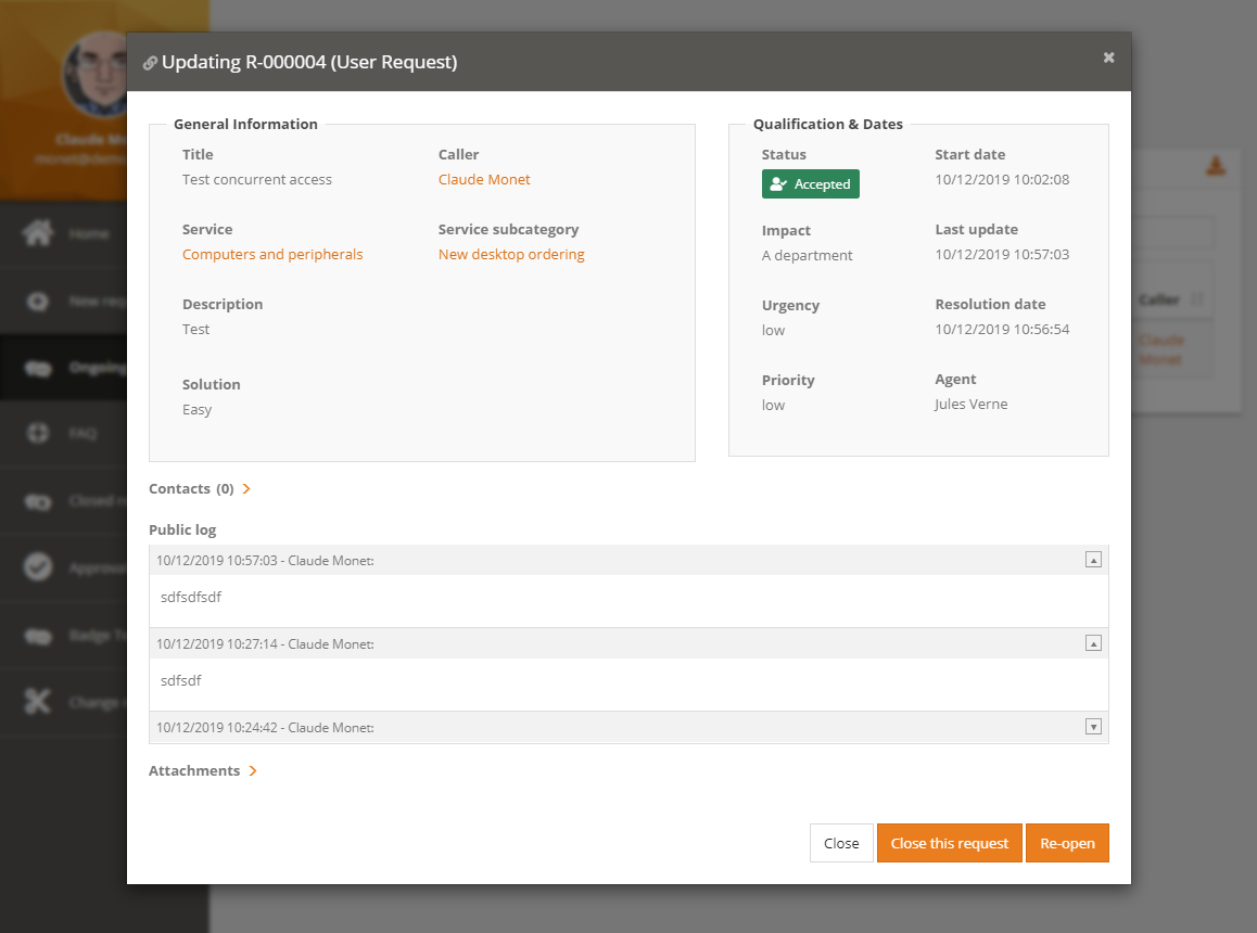
With the 2.7, we have added markup information in some pages (console and portals):
Added markup on an object details:
-
class=“object-details”
-
data-object-class=“UserRequest”
-
data-object-id=“34”
-
data-object-mode=“view” or “edit”
Added markup on a field within the details of an object
-
data-attribute-type=“AttributeEnum”
-
data-attribute-code=“status”
-
data-value-raw=“new” - For an enum, this is the
codenot the translated value
Using those markup, we can for example highlight the status of a Ticket, with different colors, based on the status value. For this, you need to write some CSS which need to be embedded in an iTop extension module. Here is an example of such CSS, which change the display for status is state 'closed', 'rejected' and 'accepted'
- my-module/public/css/console.css
-
/* Define a few colors */
$status-default-color: #757575 !default;
$status-default-bg-color: #DEDEDE !default;
$status-accepted-color: #FFFFFF !default;
$status-accepted-bg-color: #2F855A !default;
$status-closed-color: #757575 !default;
$status-closed-bg-color: #DEDEDE !default;

/* Define a reusable set of properties */
%status-icon{
        margin-right: 0.5rem;
        content: "";
        font-family: "Font Awesome 5 Free";
        font-weight: bold;
}

/* In any object-details screen, if there is an enum field called 'status' */
.object-details{
        *[data-attribute-type="AttributeEnum"][data-attribute-code="status"]{
                .field_label{
                        vertical-align: baseline;
                }
                .field_value{   /* Modify the display of the value */
                        display: inline-block;
                        padding: 0.25rem 0.6rem;
                        color: $status-default-color;
                        background-color: $status-default-bg-color;
                        border-radius: .25rem;
                }
                /* if the value is 'accepted' use some colors */
                &[data-value-raw="accepted"]{
                        .field_value{
                                color: $status-accepted-color;
                                background-color: $status-accepted-bg-color;
                                /* and add a font awesome icon in front of the label */
                                &::before{
                                        @extend %status-icon;
                                        content: "\f4fc";  /* code of the font */
                                }
                        }
                }
                /* if the value is 'rejected' or 'closed' use other colors */
                &[data-value-raw="rejected"],
                &[data-value-raw="closed"]{
                        .field_value{
                                color: $status-closed-color;
                                background-color: $status-closed-bg-color;
                                font-weight: bold;
                        }
                }
        }
}
Of course, you can expend this to define colors for every values of the status. You can make this for any enum, not only the status. You can restrict this behavior to Ticket classes…
Added markup on a row within a
list of objects
Added markup on a field within a
list of objects
-
None yet, might be worked on soon. 🚧
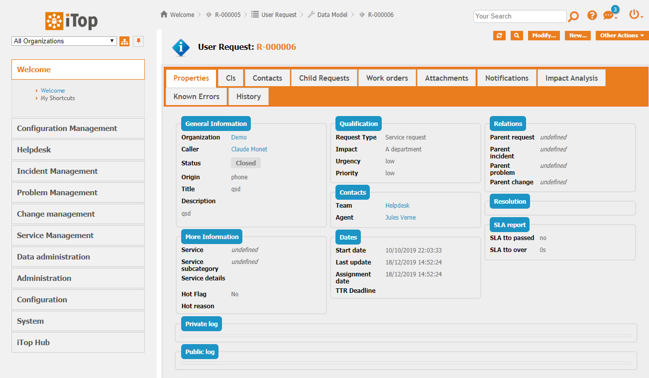
Change Console colors
iTop comes with a light-grey theme by default.
Through an extension you can now define new themes
in XML, which will give a different look to your iTop console, so
it can be aligned to your company color codes.
- itop_design
-
    <branding>
        <themes>
            <theme id="violeto-maximus" _delta="define">
                <variables>
                    <variable id="combodo-orange">purple</variable>
                    <variable id="icons-filter">hue-rotate(230deg)</variable>
                    <variable id="complement-color">MediumPurple</variable>
                    <variable id="border-highlight-color">purple</variable>
                    <variable id="combodo-dark-gray">blue</variable>
                </variables>
                <imports>
                    <import id="css-variables">../css/css-variables.scss</import>
                </imports>
                <stylesheets>
                    <stylesheet id="jqueryui">../css/ui-lightness/jqueryui.scss</stylesheet>
                    <stylesheet id="main">../css/light-grey.scss</stylesheet>
                </stylesheets>
            </theme>
        </themes>
    </branding>
Then in the Configuration file of each instance, you can choose a theme:
- Configuration
-
'backoffice_default_theme' => 'violeto-maximus',
And the console will now look like this:

How to do
To list the variables which can be changed on the console, check
this file <iTop>/css/css-variables.scss