
Customize Portal (3.3+)
Prerequisite: Get familiar with the Syntax used in Tutorials
Portal new look
Nothing is different from the previous portal in the menus, navigation and options, apart from the style, colors and display of some brick on the homepage.
Question & Answers
Q: How can I change the menu position of my
portal?
A: This can be done either in the Designer Editors
| Portal or with an iTop XML extension.
- itop-design | modules-design
-
  <module_design xmlns:xsi="http://www.w3.org/2001/XMLSchema-instance" id="itop-portal" xsi:type="portal" _delta="must_exist">
    <properties>
      <ui_settings>
        <navigation_menu>vertical</navigation_menu>
      </ui_settings>
    </properties>
  </module_design>
Customize style & colors
Q: How can I modify the colors?
A: As before you still need to write an iTop
extension with a simple css file, containing the variables that you
want to change
There are two samples on GitHub that customize the color of this new portal extension:
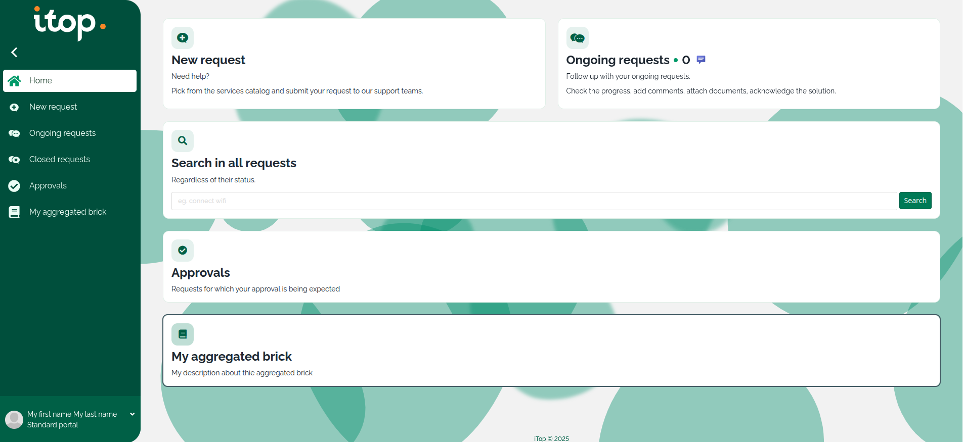
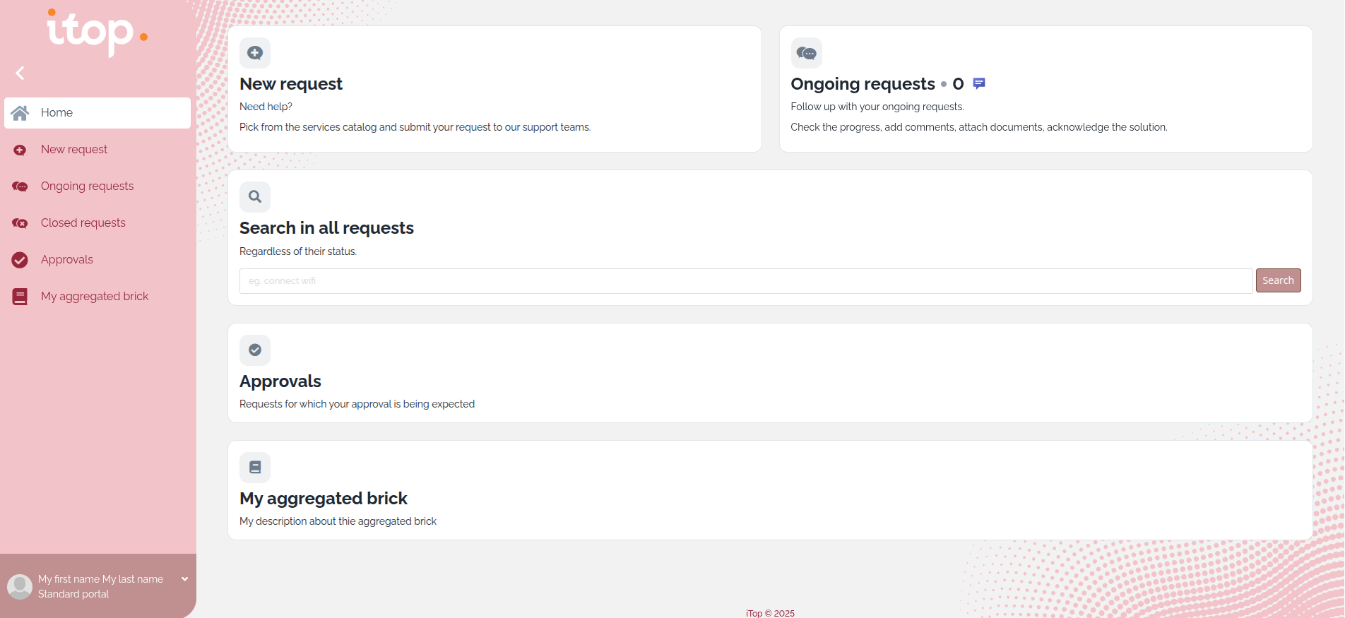
They can serve as a starting point for adapting the style of the portal to your corporate color code.
File format
/* Mandatory */
@import 'common/main.scss';
@import '../../../../itop-portal-base/portal/public/css/utils/variables/colors/_base-palette';
@import '../../../../itop-portal-base/portal/public/css/utils/variables/colors/_semantic-palette';

/* overwriting primary colors - optional */
$ipb-color-primary-100: $ipb-color-blue-100;
$ipb-color-primary-200: $ipb-color-blue-200;
$ipb-color-primary-300: $ipb-color-blue-300;
$ipb-color-primary-400: $ipb-color-blue-400;
$ipb-color-primary-500: $ipb-color-blue-500;
$ipb-color-primary-600: $ipb-color-blue-600;
$ipb-color-primary-700: $ipb-color-blue-700;
$ipb-color-primary-800: $ipb-color-blue-800;
$ipb-color-primary-900: $ipb-color-blue-900;
$ipb-color-primary-950: $ipb-color-blue-950;

/* Main navigation menu  - optional */
$ipb-navigation-menu--background-color: $ipb-color-purple-900;
$ipb-navigation-menu--user-part--background-color: $ipb-color-pink-900;

/* Hyperlink colors - optional */
$link-color : $ipb-color-blue-600;
$link-hover-color : $ipb-color-blue-900;

/* Icons colors within homepage and aggregated bricks tales - optional */
$ipb-tile--decoration--opacity: 0.1;
$ipb-tile--decoration--background-color: common-adjust-alpha($ipb-color-purple-700, $ipb-tile--decoration--opacity);
$ipb-tile--decoration--icon--color: $ipb-color-purple-700;

/* Background images of the homepage - optional */
$ipb-home--main-wrapper--before--background-image: url("../img/backgrounds/dots-left-top.svg") !default;
$ipb-home--main-wrapper--before--background-size: 30% !default;
$ipb-home--main-wrapper--after--background-image: url("../img/backgrounds/dots-right-bottom.svg") !default;
$ipb-home--main-wrapper--after--background-size: 30% !default;

/* buttons colors - optional */
/* You must copy the full table, and modify in it just the colors you need, in general just those under primary */


/* Logo height (default is 70px) */
$ipb-navigation-menu--is-expanded--top-part--logo--hyperlink--height: 100px;


/* Mandatory */
@import "../../../../itop-portal-base/portal/public/css/themes/all"
main variables
SCSS variables prefixes:
-
common or no prefix, can means applicable to Console and Portals. Eg.
common-color-primary-100andlink-color -
ipb stands for iTop Portal Base is applied on Portals only. Eg.
ipb-color-primary-100 -
ibo stands for iTop BackOffice is applied on Console only. Eg.
ibo-color-primary-100
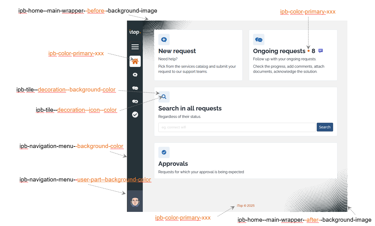
primary colors
-
does not impact buttons, nor hyperlinks alias externalkey,
It does cover:
-
Icon of the active menu (only visible in vertical menus)
-
It includes default image when there are no object in a ManagedBrick (new)
-
iTop copyright at the bottom of the homepage (new)
-
Managed Brick and BrowseBrick bullets (new)
$ipb-color-primary-100: xxx;
$ipb-color-primary-200: xxx;
$ipb-color-primary-300: xxx;
$ipb-color-primary-400: xxx;
$ipb-color-primary-500: xxx;
$ipb-color-primary-600: xxx;
$ipb-color-primary-700: xxx;
$ipb-color-primary-800: xxx;
$ipb-color-primary-900: xxx;
$ipb-color-primary-950: xxx;
Out of the box iTop colors
Menus
-
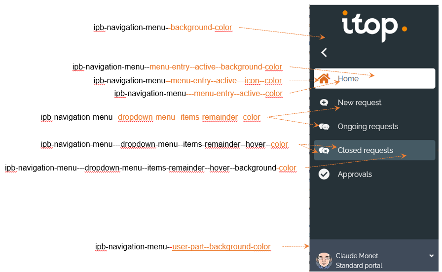
$ipb-navigation-menu--background-color: background color of the menu bar
-
$ipb-navigation-menu--user-part--background-color: background color of the user section in the menu bar
-
$ipb-navigation-menu--dropdown-menu--items-remainder--color: menu text and icon color (not an active menu, nor one with the mouse moving over)
For active menu (one at a time)
-
$ipb-navigation-menu--menu-entry--active--background-color: background color
-
$ipb-navigation-menu--menu-entry--active--color: Text color
-
$ipb-navigation-menu--menu-entry--active--icon--color: Icon color
When going hover a menu
-
$ipb-navigation-menu--dropdown-menu--items-remainder--hover--color: Text and icon color
-
$ipb-navigation-menu--dropdown-menu--items-remainder--hover--background-color: background color
Hyperlink
-
$link-color: color of the text of an hyperlink (friendlyname of an external key)
-
$link-hover-color: color of the text of an hyperlink when you move your mouse above it
Icons on tiles
-
$ipb-tile--decoration--background-color: background color of the icon
-
$ipb-tile--decoration--icon--color: main color of the icon
Homepage background images
Two images are displayed in background of the homepage only, they can be replaced or removed
-
$ipb-home--main-wrapper--before--background-image: url(“../img/backgrounds/dots-left-top.svg”) !default; /* Image top left of the homepage */
-
$ipb-home--main-wrapper--before--background-size: 30% !default; /* Size the image */
-
$ipb-home--main-wrapper--after--background-image: url(“../img/backgrounds/dots-right-bottom.svg”) !default; /* Image top right of the homepage */
-
$ipb-home--main-wrapper--after--background-size: 30% !default; /* Size the image */
Homepage background images: empty url = No image
-
Images must be stored under
./img/directory in your own extension which customize the portal thememy-itop-portal-theme. -
You can use a 100% image if it is designed for such use
-
You can use the standard images provided by
itop-portal-new-look-for-3.2-ltsextension, and change just its color, by editing the file directly and changing that part: .sto{fill:#1fed94} with a different color .sto{fill:#1fed94} -
You can also put your own images.
Buttons colors
You will find the default button colors at the end of the wiki page. It is structured this way:
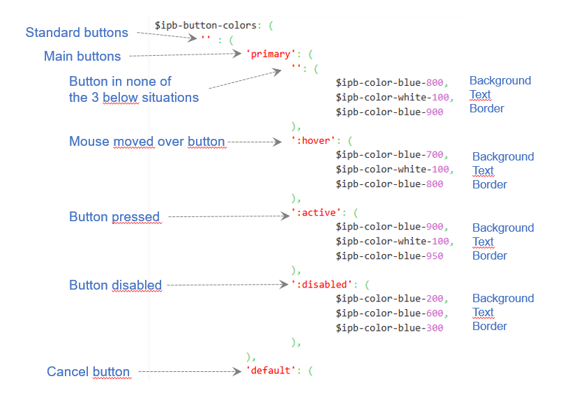
-
The top level correspond to:
-
'': Standard buttons -
alternative: Alternate buttons for extra actions, for eg. in the BrowseBrick, the 3 vertical dots, is a alternate transparent button without border
-
-
Second level, correspond to different type of buttons
-
primary: the most important button, eg. Submit button as well as all transitions buttons on User request. -
default: when the level is not defined, eg. Cancel button -
danger: when an action will delete some iTop object -
and other values which can be used by non standard bricks…
-
-
At third level, you find different entries:
-
'': Normal case -
:hover: When the mouse moves over the button -
:active: When the button is pressed/selected -
:disabled: When the button is disabled
-
-
At the lowest level, you find a group of 3 colors:
-
the first one is the background of the button
-
the second is the text color
-
the third one is the border color of the button
-
In general, changing the standard buttons Primary
part covers most customization needs.
Module dependencies
Of course in your new theme extension
my-itop-portal-theme, in the
module.my-itop-portal-theme.php file, don't forget
itop-portal-base/1.0.0 in your dependencies
- module.my-theme.php
-
      'dependencies' => array(
            'itop-portal-base/1.0.0',
        ),
Q: I want to change another color than those documented,
is it possible?
A: Maybe. For this, you need to figure out if
there is an existing scss variable which drives the color you want
to change.
If you want to change a color which is not listed in the variables above:
-
Install the extension
-
Open the portal and go over the element which color you want to change
-
Inspect that element with your browser development tools
-
Filter on
colorword -
If the color is only visible when your mouse is over the element, click on
.hovand selecthover.activeandfocusare also pertinent for some colors. -
Search for the color and just above that color, copy the first class name which has imposed that color
-
Within
my-itop/datamodel/2.x/itop_portal-base/portal/public/css/themes/or withinmy-itop/env-production/itop-portal-new-look-for-3.2-lts/public/css-
do a grep -r of this class name to see in the css file the name of the colors variable and how it is defined
-
In a few corner cases, the css class might be defined in an included file which may be in a different directory than /themes
-
Customize Other Portals
Q: How can I apply the new look on my own
portal?
A: This is automatic, all portals in 3.3 benefits
from the new style
Q: I want to apply my own new theme on two different
portals, is it possible?
A: Yes, for instance, you want to apply your
customize theme on the standard User Portal and on a specific
secondary portal, you will enter this in XML
- itop-design | modules-design
-
  <module_design xmlns:xsi="http://www.w3.org/2001/XMLSchema-instance" id="itop-portal" xsi:type="portal" _delta="must_exist">
    <properties>
      <ui_version>v3</ui_version>
      <themes>
          <theme id="bootstrap" _delta="define">my-itop-portal/css/my-bootstrap-theme.scss</theme>
      </themes>
    </properties>
  </module_design>
    <module_design xmlns:xsi="http://www.w3.org/2001/XMLSchema-instance" id="my-secondary-portal" xsi:type="portal" _delta="must_exist">
    <properties>
      <ui_version>v3</ui_version>
      <themes>
          <theme id="bootstrap" _delta="define">my-itop-portal/css/my-bootstrap-theme.scss</theme>
      </themes>
    </properties>
  </module_design>
Default button colors
Copy the full table in your scss file and modify only the one you need to change, in general just those under primary, sometimes more…
$ipb-button-colors: ( '' : ( 'primary': ( '': ( $ipb-color-blue-800, $ipb-color-white-100, $ipb-color-blue-900 ), ':hover': ( $ipb-color-blue-700, $ipb-color-white-100, $ipb-color-blue-800 ), ':active': ( $ipb-color-blue-900, $ipb-color-white-100, $ipb-color-blue-950 ), ':disabled': ( $ipb-color-blue-200, $ipb-color-blue-600, $ipb-color-blue-300 ), ), 'default': ( '': ( $ipb-color-white-100, $ipb-color-grey-800, $ipb-color-grey-600 ), ':hover': ( $ipb-color-grey-100, $ipb-color-grey-900, $ipb-color-grey-700 ), ':active': ( $ipb-color-grey-200, $ipb-color-grey-900, $ipb-color-grey-700 ), ':disabled': ( $ipb-color-grey-200, $ipb-color-grey-700, $ipb-color-grey-300 ), ), 'success': ( '': ( $ipb-color-success-900, $ipb-color-white-100, $ipb-color-success-900 ), ':hover': ( $ipb-color-success-800, $ipb-color-green-100, $ipb-color-success-900 ), ':active': ( $ipb-color-success-950, $ipb-color-green-100, $ipb-color-success-950 ), ':disabled': ( $ipb-color-grey-200, $ipb-color-grey-700, $ipb-color-grey-300 ), ), 'warning': ( '': ( $ipb-color-warning-700, $ipb-color-white-100, $ipb-color-warning-900 ), ':hover': ( $ipb-color-warning-600, $ipb-color-warning-100, $ipb-color-warning-700 ), ':active': ( $ipb-color-warning-800, $ipb-color-warning-100, $ipb-color-warning-900 ), ':disabled': ( $ipb-color-grey-200, $ipb-color-grey-700, $ipb-color-grey-300 ), ), 'danger': ( '': ( $ipb-color-danger-800, $ipb-color-white-100, $ipb-color-danger-900 ), ':hover': ( $ipb-color-danger-700, $ipb-color-danger-100, $ipb-color-danger-800 ), ':active': ( $ipb-color-danger-900, $ipb-color-danger-100, $ipb-color-danger-950 ), ':disabled': ( $ipb-color-grey-200, $ipb-color-grey-700, $ipb-color-grey-300 ), ), 'info': ( '': ( $ipb-color-information-800, $ipb-color-white-100, $ipb-color-information-900 ), ':hover': ( $ipb-color-information-700, $ipb-color-information-100, $ipb-color-information-800 ), ':active': ( $ipb-color-information-900, $ipb-color-information-100, $ipb-color-information-950 ), ':disabled': ( $ipb-color-grey-200, $ipb-color-grey-700, $ipb-color-grey-300 ), ), ), 'alternative' : ( 'primary': ( '': ( $ipb-color-transparent, $ipb-color-blue-800, $ipb-color-transparent ), ':hover': ( $ipb-color-blue-100, $ipb-color-blue-900, $ipb-color-blue-100 ), ':active': ( $ipb-color-blue-200, $ipb-color-blue-900, $ipb-color-blue-200 ), ':disabled': ( $ipb-color-blue-200, $ipb-color-blue-600, $ipb-color-blue-300 ), ), 'default': ( '': ( $ipb-color-transparent, $ipb-color-grey-800, $ipb-color-transparent ), ':hover': ( $ipb-color-grey-200, $ipb-color-grey-900, $ipb-color-grey-200 ), ':active': ( $ipb-color-grey-300, $ipb-color-grey-900, $ipb-color-grey-300 ), ':disabled': ( $ipb-color-transparent, $ipb-color-grey-500, $ipb-color-transparent ), ), 'success': ( '': ( $ipb-color-transparent, $ipb-color-success-900, $ipb-color-transparent ), ':hover': ( $ipb-color-success-100, $ipb-color-success-900, $ipb-color-success-100 ), ':active': ( $ipb-color-success-200, $ipb-color-success-900, $ipb-color-success-200 ), ':disabled': ( $ipb-color-grey-200, $ipb-color-grey-700, $ipb-color-grey-300 ), ), 'warning': ( '': ( $ipb-color-transparent, $ipb-color-warning-800, $ipb-color-transparent ), ':hover': ( $ipb-color-warning-100, $ipb-color-warning-900, $ipb-color-warning-100 ), ':active': ( $ipb-color-warning-200, $ipb-color-warning-900, $ipb-color-warning-200 ), ':disabled': ( $ipb-color-grey-200, $ipb-color-grey-700, $ipb-color-grey-300 ), ), 'danger': ( '': ( $ipb-color-transparent, $ipb-color-danger-800, $ipb-color-transparent ), ':hover': ( $ipb-color-danger-100, $ipb-color-danger-800, $ipb-color-danger-100 ), ':active': ( $ipb-color-danger-200, $ipb-color-danger-800, $ipb-color-danger-200 ), ':disabled': ( $ipb-color-grey-200, $ipb-color-grey-700, $ipb-color-grey-300 ), ), 'info': ( '': ( $ipb-color-transparent, $ipb-color-information-800, $ipb-color-transparent ), ':hover': ( $ipb-color-information-100, $ipb-color-information-800, $ipb-color-information-100 ), ':active': ( $ipb-color-information-200, $ipb-color-information-800, $ipb-color-information-200 ), ':disabled': ( $ipb-color-grey-200, $ipb-color-grey-700, $ipb-color-grey-300 ), ), ), );